
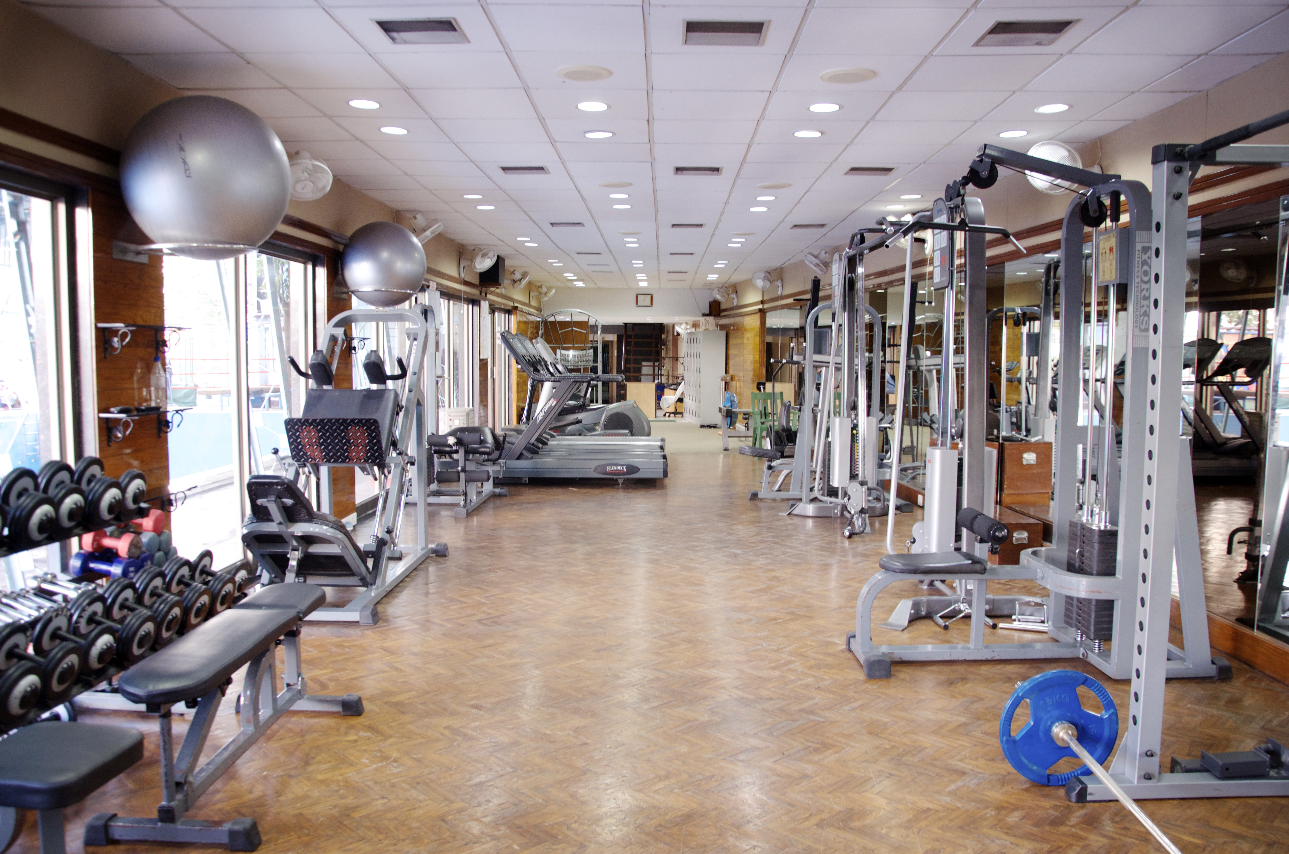
When revising my Graphic Design project I decided to use different aspects in order to make it more appealing to the eye. From the feedback I received I was told to use more tools throughout my project, as well as making my text more more fitting. I decided to make the 3 most important things in my topic numbered to make them stand out and go with my pictures. I used the text tool, along with the rectangle tool to create the colored box behind my text to make it stand out more. I also used the warped text tool for the header to add something different and catch the attention of what my topic is. With my pictures I used 3 that related to my topic the most. One of myself which my Mom took of me in San Diego, California. This represents my journey and why I have a passion about my topic. I then chose a picture of healthy food which I got from a website (will cite below), which is a very important part to a healthy lifestyle. I then used a picture of a gymnasium which I got from a website (will cite below). I chose to put the gymnasium in the background because I thought I represent it in the way that it is the most important part and the core to my topic. I used the Elliptical Marquee Tool to edit both the pictures and do something different with them. I used the tutorials in order to help me do this and refresh my memory on how to use the tools. Overall, I think that the comments and feedback were very helpful and it made me improve my graphic design project in many ways.
Sources:
Kanodia, Snehalkanodia. Wiki Gym BRC. 24 Feb. 2013. https://upload.wikimedia.org/wikipedia/commons/b/b6/Gym_wiki.jpg
Sambazon. “Healthy Meal Prep.” Wikimedia Commons, 11 Jan. 2011, upload.wikimedia.org/wikipedia/commons/e/e0/Healthy_Meal_Prep_%28Unsplash%29.jpg. https://upload.wikimedia.org/wikipedia/commons/e/e0/Healthy_Meal_Prep_%28Unsplash%29.jpg
